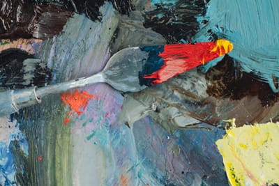
A detailed tip list of the most common color mixing mistakes and practical fixes for cleaner, more accurate, repeatable color results.
Read MoreBlog
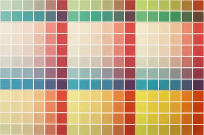
A practical, in depth list of 15 essential color palette rules for building harmonious, accessible, consistent design systems across digital and print.
Read More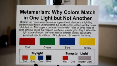
Have you ever matched two colors perfectly in the store, only to see them look completely different at home? That’s metamerism at work. Discover why certain colors that appear identical under one light source can look strikingly different under another, the role of spectral power distributions, and how this phenomenon affects design, printing, photography, and everyday life.
Read More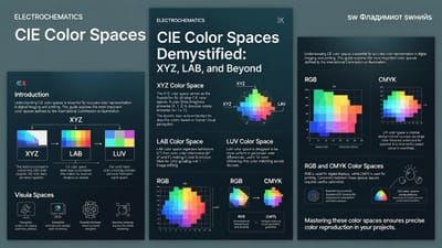
Confused by color spaces like CIE XYZ and CIELAB? Discover how the International Commission on Illumination (CIE) created the first device-independent color systems in 1931, why XYZ became the foundation of modern color science, and how LAB makes color perception more human-friendly. A clear, beginner-to-intermediate guide to the backbone of accurate color reproduction.
Read More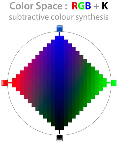
Discover the simple difference between additive and subtractive color mixing. Learn why your phone screen uses red, green, and blue (RGB) to create bright colors, while printers use cyan, magenta, and yellow (CMY/CMYK)—and why mixing paints and mixing lights behave completely differently.
Read More
Red feels bold, energetic, and unmistakable—yet it’s not an inherent property of objects. Discover the physics of light wavelengths, how a red apple reflects specific waves while absorbing others, and the biological role of your L-cones and brain in creating the vivid sensation of red. A beginner-friendly dive into why we see color at all.
Read More
Discover the astonishing biology behind color vision. Learn how just three types of cone cells in your retina, combined with clever neural processing, let you experience millions of colors — and why color is more illusion than reality.
Read More
Discover how the eye and brain work together to interpret color, from light wavelengths and cone cells to context, contrast, and optical illusions.
Read More
Vases take center stage in 2026 as sculptural accents and sustainable statement pieces. From transformative teal ceramics echoing the year's Color of the Year to earthy terracotta, jade greens, and South Asian-inspired fusions, discover how vases elevate interiors, pair with dried botanicals, and blend heritage craftsmanship with modern minimalism for regenerative, mood-boosting homes.
Read More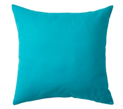
Teal pillows bring transformative energy to any space in 2026—pairing the year's Color of the Year (Transformative Teal) with earthy neutrals, bold accents, and South Asian fusion vibes. Explore styling ideas, psychology benefits, material tips, and real-life inspiration for living rooms, bedrooms, and more.
Read More
A comprehensive guide to digital and web colors in 2026—covering color spaces (RGB, HEX, HSL, OKLCH), accessibility standards (WCAG 2.2/3.0), trending palettes (Transformative Teal, earthy neutrals, bold reds), tools for generation, and best practices for UI/UX, branding, websites, apps, and social media design in a screen-first world.
Read More